MC Cabe
Tuesday, 14 December 2010
Font
For our digipack cover I have been looking at several fonts on dafont.com. I am looking for something which is a bit classy and grimy mixed together and found a couple of fonts.
Digi-Pack CD Draft

In my digipack idea I feel that if I include a lot of pictures then the audience would be attracted into buying it. The pictures that I have included are some of the group and also a picture of a location where we aim to film some of our music video and it is also a image of the area of where our group is from, London. Also I have decided to use a main colour theme of black and blue. The reason why I had used this colour theme is because I feel that these two colours work together and also they are bold colours that stand out. The fonts that I have been looking at to use in my digipack works well with my genre I think because it looks a bit classy as well as grimy and that is what our genre and what our types of songs are about. The fonts that we are looking to use is off of a website called dafont.com and the fonts are called slammertag.ttf, Tags Xtreme 2 Font. Also the layout of how we are having our track lists is set out so it takes up the back panel and you can clearly see the names of the songs.
Tuesday, 7 December 2010
Digipak CD Cover Info
A digipak is like a little booklet which is made out of a cardboard like material. A dual box only has two sides where as a digipak has several sides which can include some information or several pictures. It is also folded in like a small package and opens up with the CD which is placed in the middle.
What makes a effective digipak?
- Various images - Attractive images not useless ones so you can have a picture of the band or something that relates to thegenre of the music that will be in the digipak.
- Colour schemes - The colour schemes need to look good. They need to be bright or attractive.
- Font - The title needs to be in a good font which stands out.
- Stand out and eye catching.
- Everything should relate to your band and your genre.
- Cover Art


I have selected the above images as they all come from different music genres. The first image is of the digipack of the music group called wyth. The reason why I like this digipack is because the artist is shown as really powerful and bold and he has an image of himself on mainly all of his pages. This would be one thing that I would use when doing my digipack.
The other two images that I included was of Lil Wayne and Katy Perry both of two different music genres but they both set the same statement. They both have an image of themselves on the front of their albums with the name of their album clearly stated and I like the look of it. I think that my digipack will look a bit like both the wyth digipack and also the Lil Wayne album cover as the Lil Wayne picture relates more to my genre.
Our location to shoot
We are planning to go and film our music video at Southbank using the skating park which is there and also the other locations what Southbank provides. Our first innitial ideas was to film our video in Brighton as we could use the beach and the pier but we feel that this location is better and more suitable for of music video. These are some of the shots that we want to use:


Tuesday, 30 November 2010
Comparing other peoples blogs
In the blog that I am looking at their are some what went well's and even better if's.
WWW:
- They have included a lot of images and I feel that in my blog I have included a lot of images and videos.
- They used different types of visuals for example they would use some pictures and then also some videos.
- In their music video's they were good as they included lots of different various shots and included lots of different destinations.
- They have used a lot of examples in their music videos.
EBI:
- Some of the blogs that I have looked at they have included lots of videos but they have not included writing to go with it. In my blogs in every post I have included some visual with some writing.
- Some of the music videos are kinder boring and some shots are too long.
- They have used screen shots from different websites and advertisements such as myspace for the artist to show the artist image. This could help to improve my blog to get more screen shots.
Tuesday, 23 November 2010
Photoshop Editing
After me and my group done our photo shoot and were happy with the photos that we took, we then decided to go to the Macs and start editing the photos. Before I could do this I had to get failiar with the programme 'Photoshop' so that I could edit my photos to a good standard. So I did this and edited 2 photos as a sample and this what I ended up with.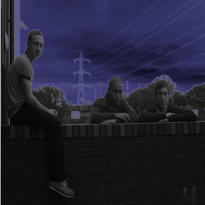
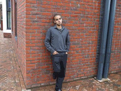
Editing these photos were really simple, it was just a matter of filtering the background and choosing different effect that I wanted to use on the background. The first image of 3 of us members of the group was a simple effect called 'Neon Glow' which obviously gives a more night time effect whilst the other effect of Nathan on his own just sharpens some of the lines that we see in the image was an effect called 'Texturizer'


Editing these photos were really simple, it was just a matter of filtering the background and choosing different effect that I wanted to use on the background. The first image of 3 of us members of the group was a simple effect called 'Neon Glow' which obviously gives a more night time effect whilst the other effect of Nathan on his own just sharpens some of the lines that we see in the image was an effect called 'Texturizer'
Talent Release Form
You need a talent release for for several reasons. The main reason why you need a talent release form is for when you are out filming and people are in the background, you need permission from the person in the background to be able to film them. So you would hand them a talent release form so you have permission to film them. Also, if you do not give them a talent release form and you film them in your music video then they could sue you for not giving you permission to film them.
Monday, 22 November 2010
Friday, 19 November 2010
Casey Working on Blogs
Thursday, 4 November 2010
CD Cover analysis Tinnie Tempah
A CD cover that I really like and think is really good is the album by Tinie Tempah 'Disc-overy' I really like the main image which is an image of Tinie Tempah holding a city in his arms and alot of different special effect graphics around him. This is very reflective of Tinie' personality and his type of music because although he is a grime artist he has a very 'Funky' feel to his music which is why the way his album cover has been made is successful. 
I think that the CD cover that I make will be similar to this with an image of the artist from our group having alot of editing around him to grab the viewers eye and make them want to buy the album
By Tinnie Tempah having not only buildings of London in his hands and also having buildings from New York City, it shows that is trying to take over other major cities or countries not only England..
Wednesday, 3 November 2010
Monday, 18 October 2010
Props Ideas
In our music video, our group decided what kind of clothes we would wear which would suit our genre, and also props that we could use such as trainers and jewelry. We believe that trainers, jeans and designer brands would suit our genre and we took pictures of these as we would wear similar clothes when doing our music video. We have a number of brands which relates to our genre such as lyle and scott, armani, vans, nike and adidas. We also think that each of us should wear similar style clothing in our music video as we are a grime band all at the same age. So these branded clothes and props would suit our music video.


Sunday, 17 October 2010
Working on our story boards


Amongst our group, we decided that storyboards would be a good way of planning our music video. Me and Nathan Powell created the storyboards and we both coloured them in to stand out and look colourful and look like we put in effort as we believed this was an important part of our planning as we would follow this step by step guide of filming. We added in what type of shot this would be, the shot number and dialogue to make it clear for us to read.
Saturday, 16 October 2010
Friday, 15 October 2010
Picture Analysis
In the images in this JPEG the mise-en-scene is not really part of the grime/rap genre. The reason for this is because we are sitting in school on a little bit of stairs in the playground. This looks more like a boy band image and that is not what our genre is. For us to make this look better and part of our grime/rap genre we should really be using locations like flats or using public locations like parks or the underground where other famous grime/rap artists use in their music videos.

Tuesday, 5 October 2010
Monday, 4 October 2010
Sunday, 3 October 2010
Saturday, 2 October 2010
Mise-En-Scene for our video (image annotation)
For our music video we need to concentrate on what we want to be seen in our video. We need to think about what looks good and what are some conventions in a Grime music video as that is what genre we are doing. Looking at some similar UK Grime artists and where they located their videos, the one that we liked most was Kano ft The Streets - Nite Nite.
This video is located on the beach cutting from night shots to day shots and it goes well with this type of song. This song is very similar to the song that we are doing with the emotions reaching out to the audience and it is sort of a slow song like ours.

In our music video one of the main locations we will be using is Brighton beach and the pier. Hopefully it will be a clear cold night so that will give off a good effect and also during the day it should be nice. We will be using Tyler's car and we will be shooting a couple of shots inside and outside of it. These types of shots inside Tyler's car are typical and they are in nearly every Grime video. They use these shots to show a sense of wealth and power.
On screen there will be shots of Casey walking along the pier and the along the sea front skimming stones across the water to give off a sad and depressed look. He will be standing not dead in the centre of the camera as we will want to show the audience what is behind him in the back ground. The shots of the waves will be in our video asit gives off a calm relaxing mood and it goes with the lyrics in our song.

In this video 'Nite Nite' it is different to most Grime videos as we are not seeing the big flashy cars and the flashy clothes and chains. Kano looks very casual and he looks approachable. He is just walking casually down the sea front and in the flash backs shown when he is walking with the girl down the road he is just being normal like any other person would. Not like in the big American rappers videos where they would most probably would be in a flashy car driving down the road.

Friday, 1 October 2010
Green Screen Fun Day
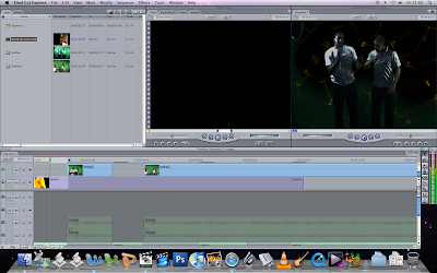
In today's lesson we was concentrating on learning on how to use the green screen and how the whole process works. We got told that you can add in different locations on the green screen so it makes us look like we are at different locations. To do this you need to go on to final cut and work through stages to make the background of the green screen different.
In this lesson every one was given roles with camera's and lighting and music directors and then every one else was acting out a music video or so called lip syncing. It was a struggle for people to get up and act as they were too nervous and shy to do this. Because no one got up and done it our teacher Mrs Ingram took to the microphone and gave us a performance on how to do it. Every one was still embarrassed and no one got up to do it.
In the second part of the lesson Paul and myself went up and done a video for our group and we done a track by Giggs called 'Talking the Hardest'. After we performed we uploaded it onto final cut and then started to edit it by adding in cuts and also using the green screen to add in effects for the background. Using final cut was a bit confusing and it was difficult to use. I had difficulty using it so I had to ask sir for help several times. I think that final cut is much more difficult to use rather then i movie as there are more tools to get familiar with and it looks like you need to have several lessons of practice to get used to using it.
Planning - Roles

Second Performer: Nathan will be the second performer singing the chorus of the song.
Editor: Nathan Powell will be the main editor of the music video but we will all contribute with the ideas of what we think willl work.
Filmer: The person filming the video will be Tyler.
Planning - Initial Ideas

Our first initial thoughts was to do a well known American artist called Eminem. The reason why we was going to do him was because we all like his music and we all look up to him. However, we was then told that we could not do a song that already has a music video so we had to re think. We then also got told that it would be better to do a UK artist so we was thinking of songs that we could do and those that do not have music videos already made. We thought of a good UK artist who is known and we thought of a man called Example. Then we looked at his album list and went on youtube to see what songsdid not have music videos and what songs we liked most. The song that we liked most was Millionaire which is a bit of the UK Grime genre. After finding the song that we liked we looked at other UKGrime artists like Example to see what kind of stuff they have in their music videos and then we looked at the conventions of a Grime music video.
We then thought of good locations where we could film after looking at the lyrics and we came up of a idea of going to Brightonfor our main location and also filiming in night clubs and inside someone's house as these locations would match the lyrics. 

The costume that our performer will be wearing will be hip hoppy with bright colours that clash eachother well so like the red and yellows with the blue or dark grey trousers with the leather jacket.

Subscribe to:
Comments (Atom)


