Labels

Tuesday, 15 February 2011

How did you use media technologies in the construction and research, planning and evaluate stages? (Music Video)

When making our music video a lot of research had to be done to get ideas of what we needed to include in our music video to make it relate to our genre. To do this I needed to use media technologies in the construction and research and planning stages to make sure that I could research some ideas. The main media technology that I used was the internet. I used the internet for several things when I was researching my music video. I had to research the conventions of the music genre that my music video related to and this was UK Grime. To research the conventions I had to look at several music videos in this genre and write down the conventions that I could see being used through out each video. Video's that I looked at were a mixture of low budgeting music videos and then also music videos from well known artists. Music videos from artists I looked at consisted of ; Kano, Roll Deep, N Dubz, Skepta, Wiley and also a couple of up and coming young unknown artists like 'The Unit' and 'Sloozie'. The reason why I looked at a mixture of these artists was because they are all within the UK Grime genre so through out each video they all would have used the same conventions and I needed to look at this to make sure I researched what I wouldinclude in my video for example the locations I would use, what my artist's costume would be, how my artist would act and also the cutting of the shots in line with the beat.


One artist that my group in a whole focused on was a young artist called Devlin. Despite looking at the other various artists, we mainly focused on he's music videos to get inspiration from because they were combined with some low budget techniques and then also some high technology techniques. Most of his music videos were located and filmed in London and we used this one idea and we went up London to film as well. When looking at his music video we also realized that some effects that he done were quite simple to do and we could use Final Cut to get these effects onto our music video.


When planning our music video again I looked on the internet on websites such as Youtube, to look at how different music video's are constructed. I looked at things such as how they start, how they finish, what types of shots they have and also what the artist looks like. This was successful as when planning my music video on the story boards, I changed some of my original ideas as I thought it would look better in another way by looking at other music videos. During planning I also had to make sure that everything was planned for when we go and film. This means where we was going to film and when we was going to film. Having a shooting schedule made things easier as everything was planned out well and we know what we had to focus on when we went to go and film.

Constructing our music video and putting it all together was difficult at first but soon it got a bit easy after I understood on how to use different effects and tools on final cut. Final cut was a difficult programme to use but we got some help and some walk through lessons on how to use the programme. Things I learnt were :


  • How to use key frames

  • How to overlay two pieces of footage into one

  • How to fade out and fade in

  • How to cut pieces of footage which leads to a jump cut

  • To use the pointer tool

  • How to brighten up pieces of footage
By learning to use these different techniques on Final Cut it has helped me to developed my skills on how to use new technologies. Even if it is hard to learn at first as I have kept on trying and using different things and different effects next time I go to use Final Cut in the future I can use these things.

How did you use media technologies in the construction and research, planning and evaluate stages? (Ancillary Task)


When doing my ancillary task I had to use a program which I was not confident on using at first but after a while after having a play around with it and picking up new skills on that way, Photoshop became a quite easy program to use.


At first I found it quite hard when making my concert poster but after a while I got used to it. At first I needed to pick a colour theme of what colours I wanted to use on my poster. The main colours that I thought would work well was blue and black so I made a background with these two colours.


After this I looked through the pictures that we took of ourartist Casey and decided on which picture looked good to edit and which one would look good on the concert posters.


After I uploaded this image on photo shop I played around with a few different adjustments of colour and also filtering and after a while my photo started to look good.


After this I added this back into the background and also downloaded a font for the text. The font that I downloaded was off of www.dafont.com as it had the font that I needed as it matched the lettering on Casey's jumper. The font was called 'ALLSTAR'.


Finally the last bit that I needed to include was where to get the tickets from and also the record label of the artist which is XL recordings.


As I was working with my partner on this digi-pack we needed to include something that was recognisable on both of our edited photo's. We decided to include some red/grey/blue fireworks so I added this behind the 'LIVE' as it gave off a great effect. This is how my concert dates poster ended up.


What have you learned from you audience feedback? (Music Video)

What have you learned from you audience feedback? (Ancillary task)

With my ancillary task I needed to get some feedback from different types of audiences to see how they think my ancillary task looked. To do this I took some still photos on my phone camera and then I uploaded them onto facebook for people to comment on them. I uploaded my digipack photo's onto facebook and got some relatively good feedback from some friends. They said that they liked the font in which it matched with the jumper with what 'MC Cabe' was wearing and another person said that they liked how I faded out the picture of 'MC Cabe' but I done it with different colours.

One negative feedback I got was that the last pictures of 'MC Cabe' looked a bit too dark and you could not really see him. This is an improvement I could make and that is to make him just a little bit brighter so it still looks like its faded out but you can see the image of 'MC Cabe'. After looking at my front cover printed out I did feel that the last image of 'MC Cabe' was a bit too dark so my aim is to brighten this up a bit.


After printing out my ancillary task of my digipack and my concert poster I showed some friends around school and got positive feedback. They mainly liked the track list at the back because they said that the image is clear and so is the font of the writing. They also said how the colouring makes a good effect as I used the hue and saturation tools to brighten things up a bit.


Feedback from my concert poster was also positive. The reason for this was because they liked how I had layed the page out with a picture of 'MC Cabe' on the right and then the details of the tour dates on the left. They also liked the colours I used as the dark blues and blacks matches the genre of my artist.

How effective is the combination of your main product and ancillary task?

When making both of my main product and my ancillary task I had to strictly focus on the appearance of my artist and how it can relate to the genre of my music video. The reason why I had to do this was because it would not look right by having my artist dressed in costume that did not suit the style of music genre and also by then having still photo's of him for my ancillary task where it did not relate to my genre at all.
The genre of my song is classed as UK grime however I feel that in this particular MC Cabe song it is more of an R&B/Hip Hop/Grime tune. It is not the typical UK Grime song that you would hear from artists like Skepta or N Dubz it is more relaxed and chilled with a calm beat to it like 'The Streets' song 'Dry Your Eyes Mate'.
To combine both my music video and the ancillary task together I had to make my artists appearance related to the song that he was doing and then I had to bring this look over to my ancillary task. The clothes that my artist was wearing would be the type of clothes that other UK Grime artists would wear, the top name brands. MC Cabe is dressed in ralph lauren tops and also Duffer jumpers.
By him wearing this it makes him look a bit more upper class not like the typical underground grime videos that you see from the likes of UK artists just arriving on the UK scene. By him wearing these upper class clothes it relates to how we located our music video as instead of filming him in urban area's we broke the conventions of a typical grime genre music video and made him more aspirational by having him located up London near some world wide landmarks for example the London Eye. To combine the main product with my ancillary task I took still photo's of my artist, 'MC Cabe', also wearing these name brand clothes whilst he is in the studios recording.
One thing that is a bit of a downfall for our combination of main music video and digipack is that on our digipack I have edited the photo's to make them look a bit more hi-tech and also brought out the colours more to make everything stand out. However on the video it gets back to reality by everything being in normal colour with it not being edited. In one way this could be effective as it could display our artist in two ways. As most of the shots on our ancillary task are in the studios and the name of the album cover is called 'In My Zone', this could show that when he is in the studios he puts everything into he's work and this could be highlighted by the fact of the hi-tech editing. However, when it comes down to the filming of the music video, he keeps every thing real and sticks to the conventions of a UK Grime music video to show that he loves the conventions of that genre and he wants to be real towards it.

In what ways does your media product use, develop or challenge forms and conventions of real media products? (Ancillary task)

My media product does not really challenge many conventions of a real media product. The reason for this is because before starting doing my digipack I looked at various different types of digipacks from all different genres and looked at how my digipack could benifit from looking at these. Things that I noticed from all the digipacks that I looked at were:

  • It had the same colour theme through out

  • It had to have a track list

  • A main front cover which clearly displays some thing about that artist or the artist itself

  • Same font all the way through

When making my digipack I had to make sure that I use the same colour theme through out so I made a background which I could use for all of my pictures. When looking at digipacks I looked at some artists that I would like my digipack to be like and one artist that caught my eye was Drake's. He is a well known artist and on the front of his album cover it has a bold picture of him. So on the front of ours I had a bold picture of MCCabe in the studio looking focused so we decided to name the name of our digipack 'In My Zone'.


Another ancilliry task that we had to do was to make a poster for our artists event. I had to do some research and look up some other artists event posters to get an idea of what I needed to include on my poster. A thing that I needed to make sure was that the poster related to the genre of what my artists music was. To do this I had to make sure the colours were right, the way every thing was layed out, the image of the artist that I had and also the font of which I used.


In what ways does your media product use, develop or challenge forms and conventions of real media products? (Music Video)

My media product uses, develops and also challenges the conventions of real media products. In my music video we had to concentrate of using the conventions that you see in every music video. These conventions are :
  • Lipsyncing must be in sync
  • Must be wearing different types of costumes
  • Have about 4 or more different locations
  • Close ups of the artist lipsyncing
  • Shots must cut in time with the beat

In our music video we used all of the things above otherwise it would have been a bit boring by seeing our artist in the same location and also wearing the same clothes. We have also developed some of the conventions by using different locations at once on the screen at the same time. Instead of just having one location on the screen then jump cutting into another location, we adding in a technique where we splitted the screen in half where we can see two different locations. Also we added in a main shot with two little boxes of action where we set a key frame of the artist was still lipsyncing and then I made a transition as one of the small boxes to spread over the full screen. Before filming our music video I looked at other music videos in our genre which we could relate to and get ideas from. Music videos that were best to us were some low budget music videos for example some of Devlins music videos and also Skepta's.

I also challenged one convention in our music video as our song is in the UK Grime category which normally means that the locations of the shots should normally be in urban areas or in dark alley ways. We did add in a couple of locations which you would normally see in a Grime music video which were in the studio and also in a alley way with graffitti on the walls. We challenged this form as we also added in some shots of our artist up London. This would challenge this form of convention as our genre would not normally see a UK Grime artist in a posh location. This would make our artist look a bit upper class so this would challenge the forms of this convention as its not in urban areas.

Tuesday, 8 February 2011

Making my Concert Poster

At first I found it quite hard when making my concert poster but after a while I got used to it. At first I needed to pick a colour theme of what colours I wanted to use on my poster. The main colours that I thought would work well was blue and black so I made a background with these two colours.

After this I looked through the pictures that we took of ourartist Casey and decided on which picture looked good to edit and which one would look good on the concert posters.

After I uploaded this image on photo shop I played around with a few different adjustments of colour and also filtering and after a while my photo started to look good.


After this I added this back into the background and also downloaded a font for the text. The font that I downloaded was off of www.dafont.com as it had the font that I needed as it matched the lettering on Casey's jumper. The font was called 'ALLSTAR'.


Finally the last bit that I needed to include was where to get the tickets from and also the record label of the artist which is XL recordings.

As I was working with my partner on this digi-pack we needed to include something that was recognisable on both of our edited photo's. We decided to include some red/grey/blue fireworks so I added this behind the 'LIVE' as it gave off a great effect. This is how my concert dates poster ended up.

Tuesday, 18 January 2011

Filming

On the 4th of January my group went up London to film. Casey, Nathan and myself left to go up London at 12.00pm but by time we got up there it was during peoples lunchtime so when we was filming there was a lot of people walking around up London. So when we was filming our shots there was a lot of people getting in the way which was quite annoying. Next time when we choose to go and film we need to make sure its a time when there is not a lot of people up London and also because it was during the Christmas holidays there was even more people up London. Also, next time when we go and film up London we need to film in the night time to have a vary of shots and also these shots will look good with all the lights on up London.


We went to a number of destination and settings such as the bridge going over the river thames, the london eye, the houses of parliment and big ben. We also went to a local park to film Casey lip-syncing the whole song which gives us more options for when we go and edit our filming. When we was filming we stood on the bridge for 10 minutes and filmed traffic going past but we also had the London eye in the background. We will be using this piece of footage but speeding it up to make it go faster to make a great effect. by making the London eye spin around faster.

On the 14th of January we went and done some filming round Nathan Powells house. We filmed quite a few little shots just for extra's for when we come to editing we can just add it in. The main piece of footage that we needed was of Casey drinking some shots and looking depreased. Also we took some more shots of Casey chilling and playing Fifa and also him in his room getting dressed.

Tuesday, 14 December 2010

Font

For our digipack cover I have been looking at several fonts on dafont.com. I am looking for something which is a bit classy and grimy mixed together and found a couple of fonts.

MC Cabe

Digi-Pack CD Draft


In my digipack idea I feel that if I include a lot of pictures then the audience would be attracted into buying it. The pictures that I have included are some of the group and also a picture of a location where we aim to film some of our music video and it is also a image of the area of where our group is from, London. Also I have decided to use a main colour theme of black and blue. The reason why I had used this colour theme is because I feel that these two colours work together and also they are bold colours that stand out. The fonts that I have been looking at to use in my digipack works well with my genre I think because it looks a bit classy as well as grimy and that is what our genre and what our types of songs are about. The fonts that we are looking to use is off of a website called dafont.com and the fonts are called slammertag.ttf, Tags Xtreme 2 Font. Also the layout of how we are having our track lists is set out so it takes up the back panel and you can clearly see the names of the songs.

Location Permission Letter

Shooting and Photoshoot Schedule

Tuesday, 7 December 2010

Digipak CD Cover Info

A digipak is like a little booklet which is made out of a cardboard like material. A dual box only has two sides where as a digipak has several sides which can include some information or several pictures. It is also folded in like a small package and opens up with the CD which is placed in the middle.

What makes a effective digipak?

  • Various images - Attractive images not useless ones so you can have a picture of the band or something that relates to thegenre of the music that will be in the digipak.
  • Colour schemes - The colour schemes need to look good. They need to be bright or attractive.
  • Font - The title needs to be in a good font which stands out.
  • Stand out and eye catching.
  • Everything should relate to your band and your genre.
  • Cover Art


I have selected the above images as they all come from different music genres. The first image is of the digipack of the music group called wyth. The reason why I like this digipack is because the artist is shown as really powerful and bold and he has an image of himself on mainly all of his pages. This would be one thing that I would use when doing my digipack.
The other two images that I included was of Lil Wayne and Katy Perry both of two different music genres but they both set the same statement. They both have an image of themselves on the front of their albums with the name of their album clearly stated and I like the look of it. I think that my digipack will look a bit like both the wyth digipack and also the Lil Wayne album cover as the Lil Wayne picture relates more to my genre.

Our location to shoot

We are planning to go and film our music video at Southbank using the skating park which is there and also the other locations what Southbank provides. Our first innitial ideas was to film our video in Brighton as we could use the beach and the pier but we feel that this location is better and more suitable for of music video. These are some of the shots that we want to use:


Tuesday, 30 November 2010

Comparing other peoples blogs

In the blog that I am looking at their are some what went well's and even better if's.

WWW:
  • They have included a lot of images and I feel that in my blog I have included a lot of images and videos.
  • They used different types of visuals for example they would use some pictures and then also some videos.
  • In their music video's they were good as they included lots of different various shots and included lots of different destinations.
  • They have used a lot of examples in their music videos.

EBI:
  • Some of the blogs that I have looked at they have included lots of videos but they have not included writing to go with it. In my blogs in every post I have included some visual with some writing.
  • Some of the music videos are kinder boring and some shots are too long.
  • They have used screen shots from different websites and advertisements such as myspace for the artist to show the artist image. This could help to improve my blog to get more screen shots.

Tuesday, 23 November 2010

Photoshop Editing

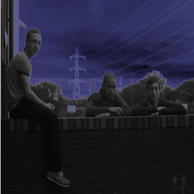
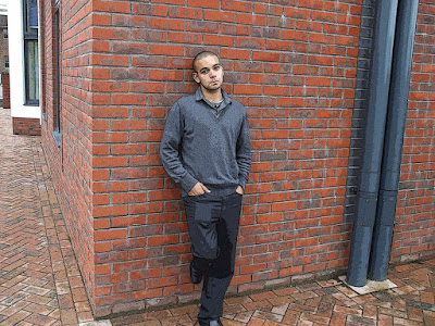
After me and my group done our photo shoot and were happy with the photos that we took, we then decided to go to the Macs and start editing the photos. Before I could do this I had to get failiar with the programme 'Photoshop' so that I could edit my photos to a good standard. So I did this and edited 2 photos as a sample and this what I ended up with.
Editing these photos were really simple, it was just a matter of filtering the background and choosing different effect that I wanted to use on the background. The first image of 3 of us members of the group was a simple effect called 'Neon Glow' which obviously gives a more night time effect whilst the other effect of Nathan on his own just sharpens some of the lines that we see in the image was an effect called 'Texturizer'

Talent Release Form

You need a talent release for for several reasons. The main reason why you need a talent release form is for when you are out filming and people are in the background, you need permission from the person in the background to be able to film them. So you would hand them a talent release form so you have permission to film them. Also, if you do not give them a talent release form and you film them in your music video then they could sue you for not giving you permission to film them.